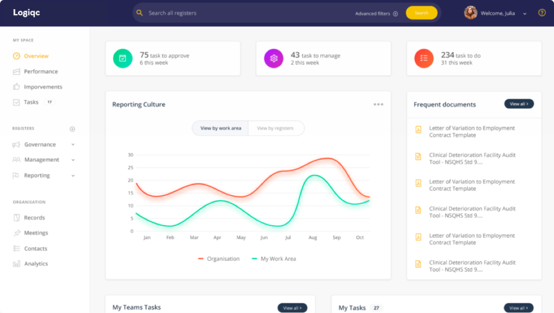
Last month, we explored the basics of UX design to create a positive user experience at every stage of the customer journey. While aesthetics is an important part of UX design, it can all fall short if friction exists.
Friction is anything that prevents users from intuitively achieving their goals while they interact with a product, platform or service. It can be anything from long load times and information gaps to poor customer service. Friction is everything that people complain about when they find technology difficult, and it can be a major roadblock in building a minimum lovable product. In fact, research has shown that two-thirds of consumers stop doing business with a company after one poor customer experience. This can also be a trigger point for negative online reviews, which can have a significant impact on reputation.
Truly lovable platforms are frictionless. At a basic level, frictionless design is about making it easier for users to do what they need to do. And when we think about our most positive and memorable user experiences, it usually involves interacting with a platform or product with ease. Interactions are intuitive, every operation is smooth and natural, and you don’t have to be a digital whiz to navigate your way around.
In addition to ease, responsiveness is another principle relevant to frictionless design. The Doherty Threshold states, ‘Productivity soars when a computer and its users interact at a pace (<400ms) that ensures that neither has to wait on the other’. Responding to this principle is relatively straightforward; we strive to provide system feedback within 400ms in order to keep users’ attention and increase productivity. Where this isn’t possible, we use progress bars to help make wait times tolerable.
So, have we eradicated all the friction in LogiqcQMS? No, not yet. It’s a never-ending process of continual improvement, as it should be. And it underpins our goal for creating a truly lovable product. The submit button is a small example of how these principles play out in our frictionless design. Yes, it’s pretty, but it also gives you feedback in under <400ms that your form has been submitted. It also provides clarity and certainty that the job has been done, which means less friction.

Another way of reducing friction involves reducing the number of clicks required to complete a command or process – which is exactly what we did with our recent enhancement to reduce the command to clear filters from three clicks to one.
If you have feedback on how we can further reduce friction in LogiqcQMS or want to know more about whether the platform is the right solution for you, let’s start a conversation.


